




Product
Use cases
Book a demo Español

What's new

Everything we are building into Nirby, version by version.

0.17.0 Forms Admin Sales Rooms

Your Forms, inside your own site

Embed any Form on your site — inline, as a popup or full screen — copy the code from a screen that shows it running, and find out which page every response came from.

Sharing a Form used to mean sharing a link. Anyone who wanted it on their own site made do with a fixed-height snippet that never grew, never fitted, and that nobody could preview. Now a Form really embeds: under Share → Embed you pick how it should appear, tune how it looks, and copy the code while watching it run.

What's new(5)
  • Three ways to embed. Standard, inline on your page like any other section. Popup, over your content, in a corner or as a centered window. Full Page, taking over the screen. Pick one and the screen shows you the result right away.
  • What you see is what you paste. The right-hand panel is not a mockup — it is your Form running inside a sample page, with the very code you are about to copy. Anything you submit from there is stored as a test, never as a real response.
  • It fits your page. The Form grows and shrinks with its content as the visitor moves through it, can sit left-aligned for narrow columns, and can let your own background show through while keeping its colors and typography.
  • The button that opens it is yours. We plant nothing in the corner of your site — a Popup opens from whichever element you choose, be it a button, a link, or on its own after a few seconds.
  • On some platforms the link is enough. Paste a Form’s address into Notion and it embeds itself, name included.
Where each response came from(2)
  • Every Submission now tells you how it arrived: through a direct link or embedded, and in that case from which page of your site. You will find it in a new block inside the response’s detail.
  • Your site can pass data along. Whatever your page carries in its address — a campaign, a plan, the section it was opened from — travels with the response and shows up right there. Nothing to configure: it just needs to be in the URL, or on the button that opens the Form.
Deciding where it can be embedded(3)
  • Under Settings → Embedding you can restrict which domains may embed your Workspace’s Forms. While the list is empty — as it is today — any site can, which is how it has always worked.
  • It only covers Forms embedded with the current code. Links you share directly, and pages already running an older snippet, keep working anywhere.
  • A change to that list takes up to five minutes to reach every visitor.
Improvements(3)
  • Every generated document is now its own stop in the Sales Room, with its own marker and in the position you decide, instead of a grid of attachments buried inside the proposal. No existing room changed: the editor keeps the order they already had.
  • While a document is still being generated, the room holds its place in the journey, so the progress counter no longer jumps when it shows up.
  • When an embedded Form finishes, the Sales Room opens in a tab of its own. It is where the visitor can come back any time, so it deserves a real window rather than a box inside someone else’s page.
Fixes(1)
  • The step that asks for a company website now uses your Form’s colors, instead of a fixed dark background that clashed with everything — and that, inside someone else’s page, showed up as a black rectangle.
0.17.1 Decide what happens when someone finishes your Form

The title, the message and where the visitor goes next are now decided together in the success screen. One destination, picked by you — their Sales Room, a page of yours, or nowhere at all.

The end of a Form was scattered. The copy the visitor reads was written inside the Pipeline, the buttons and the redirect somewhere else, and between the two you had to guess which one won. Now it’s one screen and one decision: in Settings → Success screen you write what gets read and pick where it leads, with no ambiguity.

What's new(5)
  • One destination, and you pick it. Nowhere, and the thank-you screen closes the journey. Sales Room, and the visitor walks into theirs. A URL, and they go back to your site, or wherever you choose. There used to be two settings that could disagree; now it’s one question with one answer.
  • You can create the Sales Room even when you send the visitor back to your site. Those are two different things, and until now they were forced together. Tick the box and the room is still created, documents and all, and reaches the visitor by email while you send them to your own thank-you page.
  • Open the destination in a new tab. Meant for Forms embedded in someone else’s page, where taking the visitor’s page with you is too much. Picking it turns off auto-advance on its own, because browsers block a window a person didn’t open.
  • You set how long it waits before taking the visitor there — including to the Sales Room, which used to be a fixed ten seconds.
  • Several endings in one Form. If your Pipeline branches, each branch can end differently — its own message, its own destination — and the End block picks which one it runs.
Changes(3)
  • The digital room has its own tab now, next to Pipeline, instead of living inside Settings. It’s one of the screens the visitor walks through, so it now sits where you’d look for it. Old links still work.
  • The Pipeline’s End block no longer holds copy: it only picks which ending it runs. Whatever you had written there is kept as it was, and shows up in the success screen the first time you open it.
  • When you embed a Form as a Popup, the screen warns you if finishing redirects to an address of yours, since that navigates the page you embed it in.
Fixes(3)
  • The final message no longer talks about next steps when there aren’t any. A form with no room and no buttons now ends by saying nothing else is needed, which is what actually happens.
  • The switch that hides Foreby’s mark in the Sales Room told people they needed a paid plan when they already had one.
  • On short windows, two screens left buttons off-screen with no way to reach them — adding a step to the room, and the success screen when it has several buttons. Both scroll now.
0.17.2 Every attempt at an embedded Form stands on its own
Fixes(2)
  • Closing an embedded Form halfway no longer confuses the next attempt. When a visitor closed the popup mid-Form and opened it again — or reloaded the page partway through — their answers, their Sales Room and their analysis could end up recorded on the previous attempt’s submission, leaving the new one empty: no conversation, no analysis, no room. Each attempt now starts clean, and everything it produces stays on its own submission.
  • The Success screen shows the ending your visitors actually get. On Forms set up before 0.17, the editor could show “Sales Room” as the destination while visitors actually landed on a closing screen — and saving without changes didn’t correct it. What you see under Settings → Success screen is now what runs, and what you save stays saved.
0.16.2 Forms Admin Sales Rooms

Every Form owns its design

A Form’s look — background, colors, logo and the image in its Sales Room — is now set on the Form itself, with no shared configuration underneath it.

Design used to live in two places: a set of Workspace-wide settings, and whatever each Form chose to override on top. Changing one Form’s color meant first working out which of the two was winning. Not any more — a Form’s design is set on that Form, under Settings → Design.

No Form changed how it looks. Every one kept the exact colors, logo and image it was already showing.

What's new(3)
  • One place to look. Background, the colors of each zone, the logo and the Sales Room image are all edited on the Form’s Design screen. There are no shared settings left that could be quietly overruling what you see.
  • The “use global styles” switch is gone. The color editor is always visible, and leaving a field empty means that color falls back to the Foreby default. The grey text inside each field is exactly what will be used if you type nothing.
  • Two Forms in the same Workspace can look nothing alike, with neither one dragging the other along — which is what you want when they speak to different audiences.
Changes(3)
  • Clearing the logo or the room image now removes it. They used to fall back to a Workspace-wide value; today the Form is simply left without one, which is what the gesture suggests.
  • A new Form starts with Foreby’s default look. Add your branding on its Design screen when you want it.
  • The old addresses for the Workspace Design and Onboarding settings now land on Settings, so any bookmarks you kept still work.
Improvements(4)
  • The Sales Room welcome is now a card with a surface of its own, and its text uses the colors you picked for cards.
  • Your company name and the visitor’s name move up into a header of their own. As a result, a Form with no image no longer draws an empty band — the room starts straight into its content.
  • The featured video returns to its thumbnail once it scrolls out of view, and the same player now serves both the welcome and video steps.
  • The room starts higher up and breathes better: the header is centred and the spare space at the top is gone.
0.16.1 The room chat asks to be typed in
Improvements(8)
  • The chat at the bottom is no longer a button with a label — it is a field that reads “Ask anything…”. Tap it and it opens with the cursor already there, ready to type.
  • The chat window lost its title bar: the conversation now runs to the top edge, and the box you type in floats at the bottom with messages passing behind it.
  • The chat always uses its own colors, light or dark depending on your Form’s background. It used to borrow the theme’s, and some combinations left it blending into itself.
  • The suggested questions above the field also open on hover, no click needed, and they now rise straight up. They look like the ones the chat offers inside — they are the same questions.
  • The journey line follows your reading from the middle of the screen, instead of trailing behind where you were looking, and a dot now marks how far you have got.
  • The journey line no longer breaks under each milestone: it runs unbroken from start to finish.
  • Everything clickable inside a milestone is the same size and reacts the same way to the pointer. A few pieces stretched full width and read like form buttons.
  • The room’s welcome is centered, and the featured video uses the full width available.
Fixes(2)
  • A step’s description showed up twice when its milestone was already displaying it.
  • The end-of-journey celebration used Foreby’s colors instead of your Form’s.
0.15.0 Sales Rooms Forms Admin

Every room knows who walked in

Completing a Form now emails the contact a personal link to their room, and that link is what identifies them at the door. Holding the address is no longer enough to get in — and you can cut off one person without closing the room on everyone else.

A Sales Room used to be as private as its address. Anyone who had the link could open it, and the only way to take access away was to archive the whole room — for everybody at once.

Now every room asks who you are. When a Form is completed, the contact gets an email with a link that belongs to them; it lets them in and stops working the moment it is used. What lasts is their session in that browser, for 30 days — so a forwarded email, or one pulled out of a trash folder months later, opens nothing. And you can revoke one person’s access without touching anyone else’s.

⚠️ Room links you have already shared are still valid addresses, but they no longer open the room straight away. Anyone arriving that way lands on a screen where they enter their email and get their own link back within seconds. The door still opens; it just isn’t instant.

What's new(10)
  • An access email when they finish: completing a Form sends the contact their personal link to the room. It carries one thing — the way in — because their answers are already inside.
  • The email says what it is for: your Form’s name is in the subject line, and it is signed with your company, your logo and your name in the header. Two notices from the same company in an inbox, and the reader still knows which one to open.
  • Whoever just filled in the Form walks straight in: nobody is asked to prove who they are two seconds after typing their email.
  • Resend and revoke, from your dashboard: the Sales Room tab shows how many live ways in that room has and when the last one was used, and lets you resend the email or revoke access on the spot. Archiving a room is no longer the way to lock somebody out.
  • A lost link is not your problem to solve: the entry screen takes an email and sends that person their access again, with no action from you.
  • Your team gets in without the email: “Open” takes a workspace member into the room already identified. “Copy link” is unchanged and still copies the plain public address — a personal link pasted into a team chat is one person’s key in everybody’s hands.
  • Visitors can download what they uploaded: the files they handed over inside the room are theirs to retrieve whenever they need them.
  • Their progress follows them across devices: opening the room on a phone no longer loses where they were, and it never moves backwards.
  • The Form’s final screen is yours: up to four buttons of your own with their links, plus an automatic redirect on a countdown to wherever you choose. Set it up in Settings → Final screen; clicking any of your buttons cancels the countdown.
  • A closed room is properly closed: close it and the chat, the steps and the file uploads all go read-only. There is no longer any route left for writing into it.
Improvements(3)
  • One switch for the branding: the toggle in Settings → Sales Room now covers both the room’s footer and the access email’s, which read “Created with Nirby: Foreby”. Still a paid-plan feature, and still keeping your preference if you move down a plan.
  • The success screen no longer promises an email that isn’t coming: what it says depends on what actually gets sent.
  • Your team’s visit isn’t counted as the client’s: opening a room from the dashboard no longer marks it as seen by the person who received it.
Fixes(7)
  • “Resend access” never actually sent anything — it returned an error claiming the contact had no email address, on contacts that did.
  • Asking for the link again from the entry screen replied “we’ve sent it” without sending it.
  • Emails went out with some of their styling stripped: the access button, the header and the paragraphs of the proposals you send lost their size, weight and colour.
  • A Form set to English sent an English email closing with a Spanish footer.
  • The preview line inboxes show repeated the subject instead of previewing the message.
  • “Open room” from the dashboard opened a blank tab.
  • On a light theme, a completed step’s mark vanished inside its own circle, a document window rendered almost black behind dark text, and product block prices and carousels used Foreby’s colour instead of yours.
0.16.0 Sales Rooms Forms Admin

The room is a timeline now

The journey stopped being an index that pointed at other sections — it is the room. Every milestone holds its own content, and you decide the order, what shows up, and how each one opens.

A Sales Room used to be a list of next steps at the top and a pile of sections underneath. Reading the proposal meant clicking a row, scrolling down to it and finding your way back. The journey described the room instead of being it.

Now it reads top to bottom as a single timeline. Each milestone carries its content inside, the line draws itself as the visitor scrolls, and finished milestones light up along the way. What appears, in what order, and how each piece opens is yours to set in Settings → Sala digital.

What's new(9)
  • You set the order: the built-in milestones (their answers, the proposal, the documents, booking a call) and the steps you write live in one list you can reorder and switch on or off individually.
  • A step can deliver, not just ask: write your own copy, embed a video, link out to a page, or leave a file to download. Until now a step could only ask a question.
  • Your copy can carry blocks the AI writes per visitor: the rest of the step shows exactly as you wrote it.
  • You choose how each milestone opens: a card that expands in place, a full-screen window, or content that is always visible. Long things fold, short things stay open, and you can change it per step.
  • The recommendation becomes an editable step: one click turns it into a Content step with your instruction inside, and from there you edit it like any other. Rooms you already created stay as they are until you press it.
  • The room’s welcome is yours: your own heading and message, with the default greeting offered as a suggestion. Leave it empty and nothing changes.
  • The chat sits at the bottom, always within reach: no more scrolling to find it. Suggested questions stack above the button, and picking one opens the chat and asks it. You can turn it off per Form when a room doesn’t need it.
  • An optional step can be skipped: someone who would rather not answer moves on without leaving it half done.
  • Progress follows the visitor across devices: finishing something on a phone and opening the room on a laptop no longer starts from zero.
Improvements(8)
  • One centred column: the side panel is gone. The featured video moved up into the header and your contact links moved down to the closing note, which is where visitors look for them.
  • The line tracks where the reading is: it draws with the scroll and lights each milestone as it passes. Colour is left to say what’s done.
  • Every finished milestone shows its date next to its dot, on wide screens.
  • No milestone is left impossible to finish: reading, watching a video, opening a link or downloading a file all close their own. Only fillable things used to count.
  • The finish is celebrated once: complete everything and the room scrolls back up so you see the full bar. Reloading doesn’t replay it.
  • Editing an answer can be undone: a cancel button brings back what you had saved.
  • Videos load on click: a room with several stops loading them all upfront.
  • Their answers say which Form they came from, which wasn’t obvious in a room opened weeks later.
Fixes(5)
  • The chat offered one set of suggested questions and the button at the bottom a different one, and the ones at the bottom never refreshed as the conversation moved on.
  • The file upload step rendered white on light-themed Forms, as did the option letters in multiple-choice questions, which came out in Foreby’s colour instead of yours.
  • The chat window only closed with its X — clicking outside or pressing Esc did nothing — and its scrollbar sat on top of the text.
  • The floating progress bar showed up the moment the room opened, duplicating the one already on screen.
  • The closing note went missing when a Form had no contact links.
0.13.0 Forms Sales Rooms Admin

Your Forms in your brand, end to end

Set the background, the card and the buttons as separate colours, with a preview that repaints as you type. The Sales Room picks up that same design, and now works just as well in light as in dark.

A Form used to give you three colours, all of them meant for a dark background. Ask for a light brand and things broke in places you could not see coming: a heading that vanished, a button whose label would not read, suggestions that disappeared into the page.

A Form’s design is now organised into three zones — the page background, the card people answer on, and the accent colour — and each one carries its own colours. That is what finally makes a dark card on a light background possible, or the other way round, without anything going unreadable along the way.

What's new(7)
  • Three zones, their own colours: the background and what sits on it, the card people write on, and the accent are set separately. A colour picked for the background no longer decides how the inside of the card reads.
  • Four ready-made themes: Dark, Light, Warm ivory and Corporate blue. Applying one fills in the fields and you take it from there; nothing is stored until you hit Save.
  • A preview that keeps up: next to the colours sits a miniature of the real Form that repaints as you type — and it also shows you what your Form inherits from the Workspace when you are not overriding it.
  • A proper colour picker: pick each colour with your system picker or paste its code. Leaving a field empty means inherit, and the field shows you which value it would inherit.
  • Contrast warnings: when a text would read poorly on its background, we tell you, with the actual number. It is a warning, not a block — the call is yours.
  • Button text works itself out: whichever accent you choose, the text on top adjusts so it always reads. Nothing to configure.
  • The Sales Room picks up the Form’s design: background, accent and text. And it holds up in light and dark alike — cards, lists, buttons and the AI’s own write-up all adapt to the background you choose.
Improvements(3)
  • The first step of the form now uses the same card as the rest, so the person answering sees one single piece from beginning to end, with your company logo above it.
  • Moving between questions has a transition: the answered one recedes and the next grows in from behind, instead of a hard cut. If you have “reduce motion” switched on, the form advances without animating.
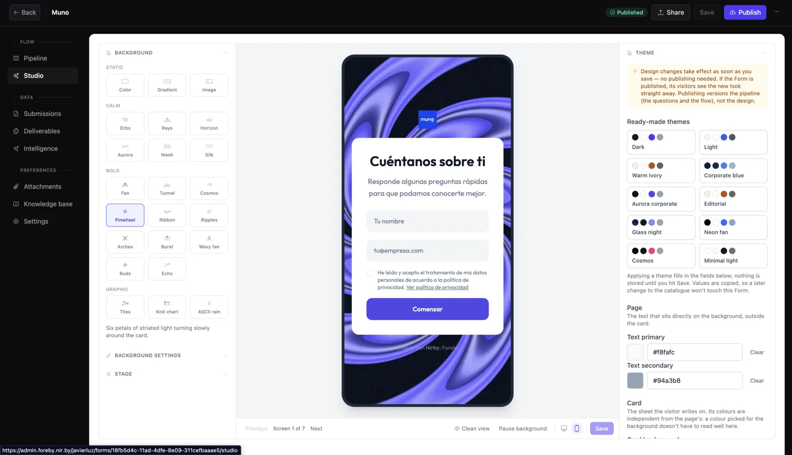
  • Design changes take effect when you save, no publishing needed. Publishing stays for a Form’s questions and flow.
Fixes(2)
  • Deleting a Questions Stack now takes its questions with it, and any that were left stranded by earlier versions come back as standalone questions.
  • Various visual fixes in the Form editor, the Contacts tables and other screens across the panel.
0.14.0 Sales Rooms Admin Forms

The Sales Room becomes a guided journey

Whoever gets a room no longer sees a checklist parked in a side column — they see a path that draws itself as they move through it. And from the admin you can see whether they opened it, how far they got, and when they finished.

A Sales Room already held everything it needed — the proposal, the documents, whatever you asked your client for, the chat — but scattered across loose pieces, with a list of next steps tucked into a side column. People arrived, saw a lot, and had no idea where to start.

The room is that journey now. The steps take the centre, joined by a line that gets painted as you go: solid behind you, dotted ahead. Each step takes you to its section, and finishing them all completes the path top to bottom.

What's new(12)
  • The journey is the room: the steps stop being a side list and become the main column, each one showing where it stands — done, you are here, still pending.
  • Finished steps get out of the way: completed ones group together and fold up, so what you read is what’s left. Reopen them whenever you like — the room remembers how you left it.
  • The steps speak your Form’s language: someone applying for a role reads “Your application” and “Book an interview”; someone receiving a commercial proposal reads “Review your proposal”. Nothing to configure.
  • “Your answers”: the room keeps what your client replied and hands it back whenever they want to check, with no email to dig up and no form to revisit.
  • On mobile, a progress bar follows you: scroll down the room and a mini-map appears at the top with “3 of 5”; tap it to jump back to the journey.
  • A “Sales Room” tab on every Submission: from the admin you can see the room’s state, copy its link, review the activity, download what your client uploaded, and regenerate the recommendation.
  • Close, reopen and archive a room: closing makes it read-only; archiving switches the link off, which is the only way to take access back from someone who already has it. The admin says exactly that before you do it.
  • You know if they opened it and how far they got: the tab shows their real progress, and the timeline gains two milestones — when they saw the room and when they finished it. If they never opened it, it says so; that no longer looks like “came in and did nothing”.
  • A “Sales Room” column in the Submissions table: every room’s state and progress at a glance. It ships off — turn it on from the column picker.
  • A contact’s rooms, summarised: their profile now shows how many rooms they have, how many they opened and how many they completed.
  • Settings → Sales Room: the section previously called Onboarding now holds the room’s whole policy, branding included.
  • Remove “Created with Foreby”: available on paid plans. Drop to a lower plan and the line comes back, but your preference is kept and applies again when you upgrade.
Improvements(4)
  • The room arrives now, it doesn’t just appear: banner, journey and content come in one after another, with the path drawing itself behind them. Complete the last step and the path finishes painting — then the celebration lands.
  • With “reduce motion” on, nothing animates: everything mounts in place from the first frame, with no waiting.
  • A room opened in a background tab no longer sits blank: if you’re not looking at it, the entrance simply doesn’t run, and the content is there when you come back.
  • The “Created with Foreby” line closes the page, instead of hanging off a corner of the side column.
Fixes(1)
  • The room’s dialogs — the document one and the booking one — close with the Escape key, not just with the mouse.
0.12.0 Forms Admin Platform

See your Form as you build it

The editor now shows, next to the canvas, the exact screen your respondents will see — and the whole Form can be walked through before you publish it.

Designing a Form meant working with boxes and arrows, and finding out how it actually looked meant opening it somewhere else. That gap is gone.

The editor has a new panel that draws the real screen behind every step — your Form’s design, its colours and its fields, exactly as a respondent gets them — and it can be walked from start to finish, picking which branch to take at every fork. The canvas changed too: a card now shows what its step says, not what type it is.

What's new(6)
  • Preview: a new tab in the editor’s side panel draws the screen the selected step produces, with the Form’s real design.
  • Walk the whole Form: move screen by screen with the buttons or the arrow keys. At a fork you choose the branch and the path is recalculated; the canvas follows along and highlights the step you are on.
  • Desktop and mobile: a switch draws the screen inside a real phone-width frame — no scaling tricks — so you can see where options break into one column and where they don’t.
  • Canvas cards show their content: the full question, its options as chips, the branches of a decision. Zoom out and they fold into a label, so a large flow still reads as a whole.
  • Tidy up: one button lays the flow out as a clean hierarchy, with no overlaps and framed in view. One click undoes it if you prefer what you had.
  • You see the AI’s edits arrive: ask the assistant for changes and the new steps come in one after another, the camera frames them, and the preview jumps to the first new screen.
On the public site(4)
  • Nirby in English: the public site is now in Spanish and English, with a switcher in the header. Including this changelog.
  • Blog: articles with categories, topics and search, plus a series comparing Nirby with other capture tools.
  • Legal documents: privacy, terms and conditions, SLA and support policy, each with its own address so you can cite it in a contract or an email.
  • Use cases by industry: insurance, telecoms, consulting, construction, pre-approved credit campaigns and real estate agents, each told from that industry’s day-to-day.
Changes(2)
  • “Test” and “Preview” are no longer the same thing. Test opens your Form in the real viewer, with AI, and stores a submission marked as a test. Preview is the editor’s simulation: it calls no AI, creates nothing, and is there to review the journey while you design it. The button that used to say “Preview” now says “Test”.
  • In a multiple-choice question, options now adapt to the actual width they are drawn in — which matters when a Form is embedded in a narrow space.

Subscribe by RSS